A Future-Forward Refresh for South Florida’s Real Estate Leader
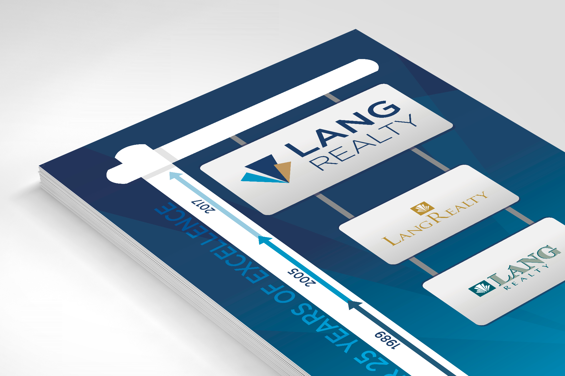
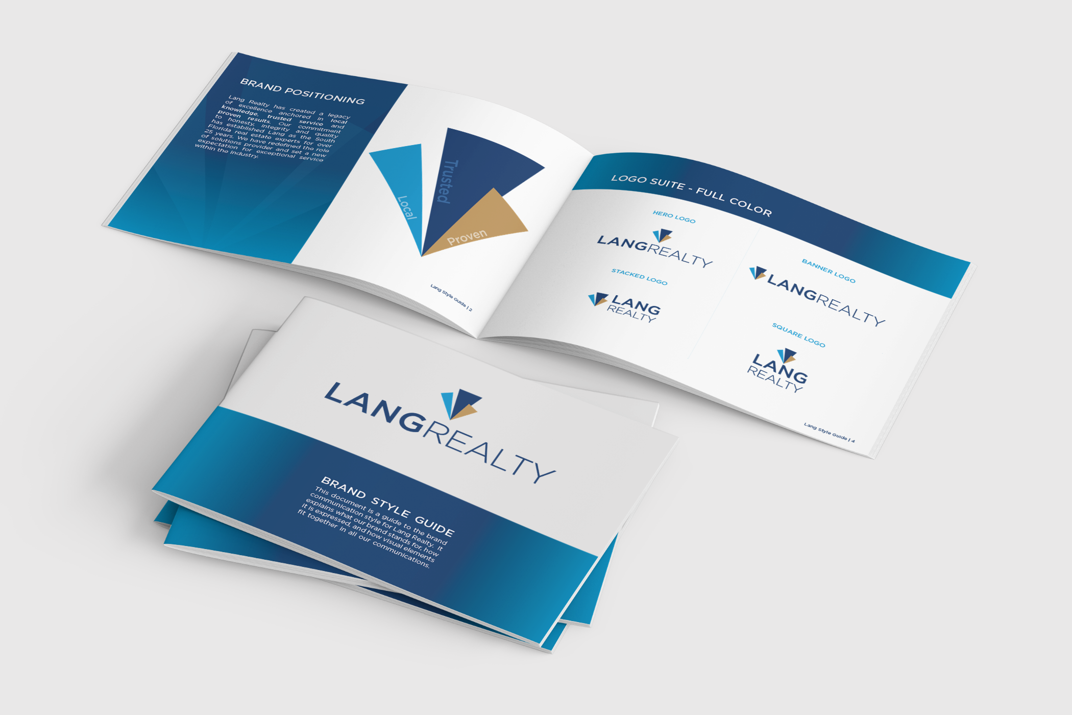
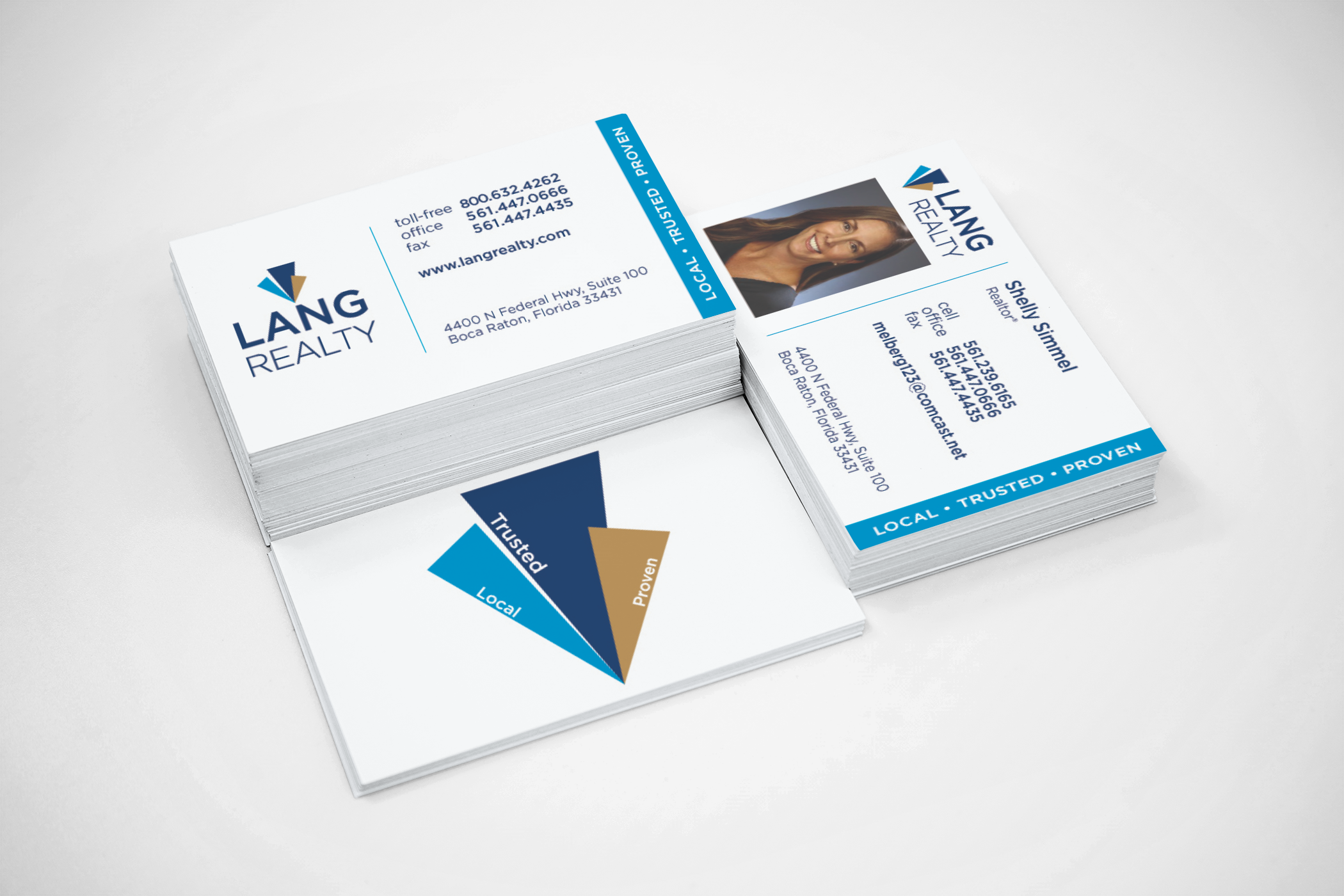
In South Florida’s competitive real estate market, first impressions are everything. Lang Realty’s redesigned logo balances traditional authority with a clean, modern aesthetic. The mark features intersecting geometric elements representing three core pillars: local knowledge, trusted service, and proven results. By pairing crisp, digital-first typography with vibrant graphics, this new visual identity honors Lang's legacy while positioning them for future growth across South Florida’s luxury markets.
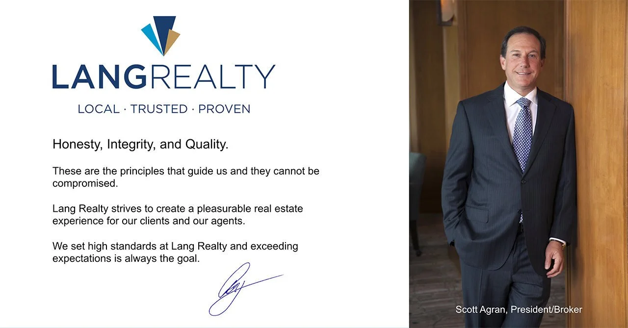
“I am so pleasantly surprised how much I love our new logo. As you know, I could not imagine a scenario where we could allow for a big departure from our established logo. Your professionalism and diligence made it possible.”
— Scott Agran, President | Lang Realty
Unique identies, seamless cohesion
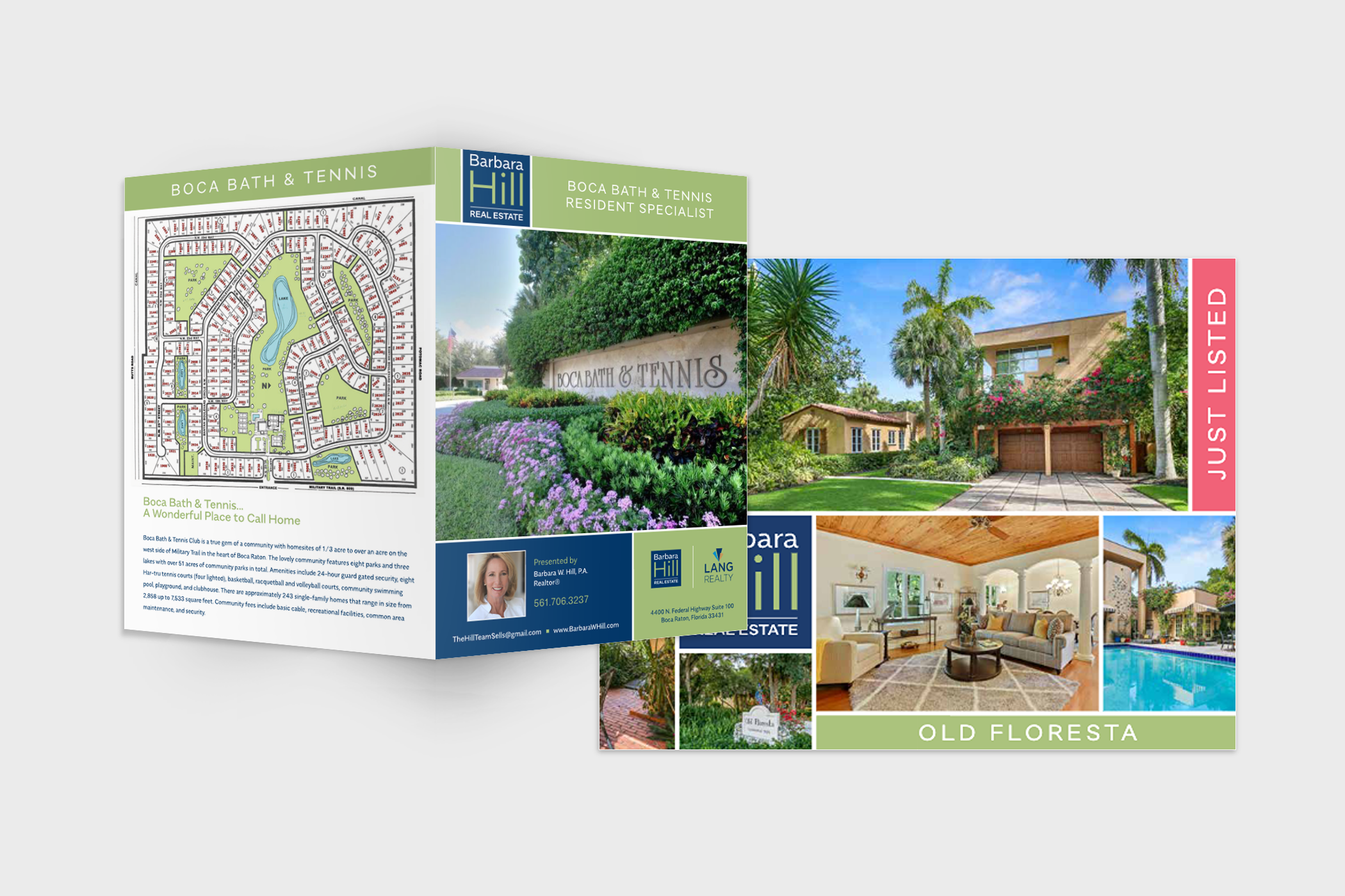
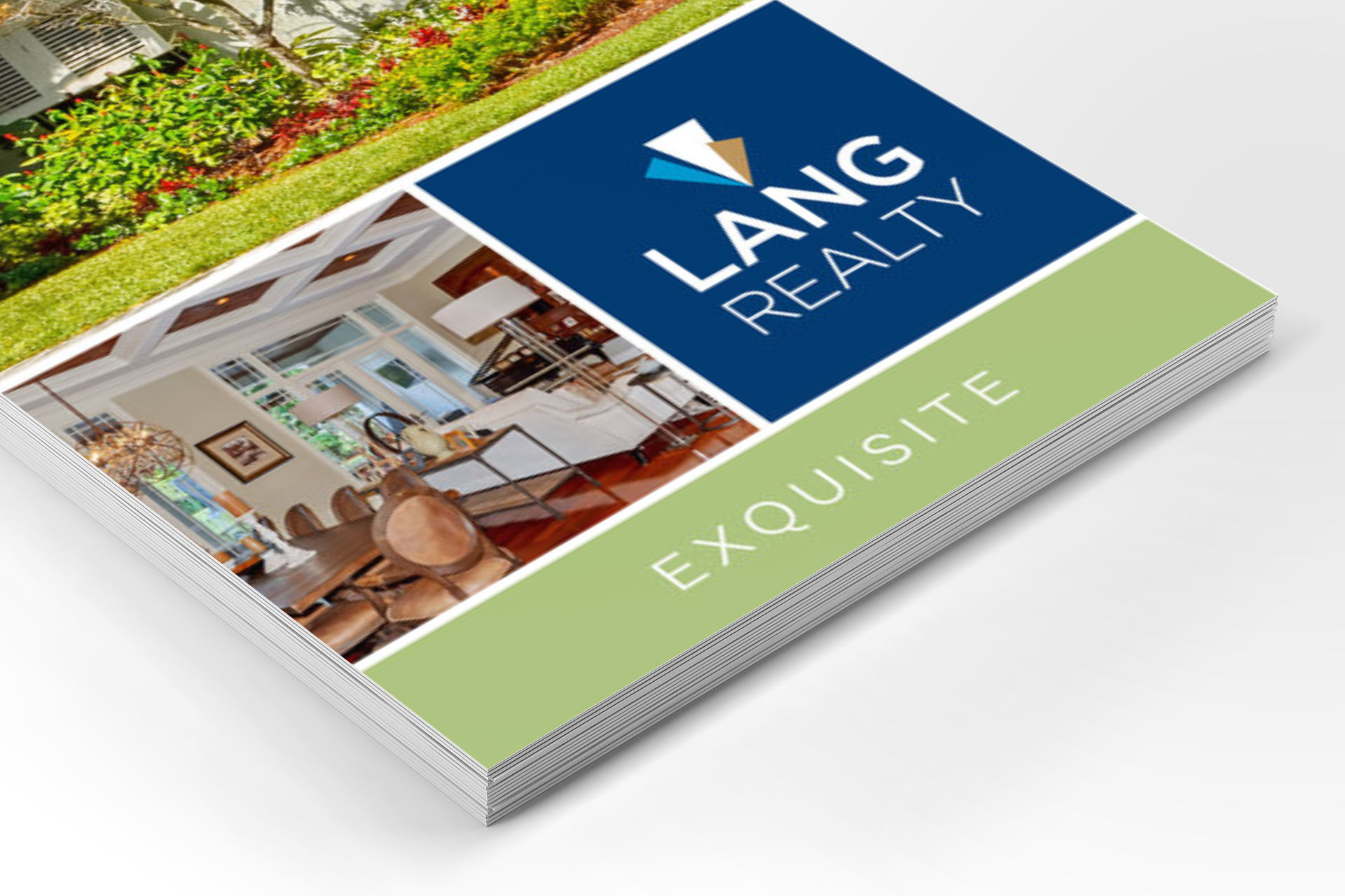
As an extension of the original project, we were engaged by top local realtors within the Lang community to craft custom brand identities. By blending each agent's unique style with the core Lang brand, we expanded the reach of the organization and empowered each agent to stand out in a competitive market.